

Chpater 3: UI Building Blocks
Now that your project structure is in place, it’s time to dive into the core UI components that power every React Native app.
In React.js, you’ve worked with div, span, and CSS for layout and styling. React Native replaces those with its own component set, designed for mobile platforms.
In this chapter, you’ll learn:
- How to layout UI with
ViewandText - Building scrollable lists using
ScrollViewandFlatList - Making components interactive using
TouchableOpacityandPressable - Creating a functional Task List Screen
3.1 View: The Div of React Native
View is the most fundamental building block. It’s like a div in React.js.
- A layout container, not interactive by default.
- Used for grouping and styling UI elements.
- It doesn’t respond to user taps.
Usage:
import React from 'react';
import { View, StyleSheet } from 'react-native';

export default function BoxExample() {
  return (
    <View style={styles.container}>
      <View style={styles.box} />
    </View>
  );
}

const styles = StyleSheet.create({
  container: {
    flex: 1,
    justifyContent: 'center',
    alignItems: 'center',
  },
  box: {
    width: 100,
    height: 100,
    backgroundColor: '#3498db',
  },
});
What it does: Renders a centered blue box.
3.2 Text: Displaying Text Content
Unlike React.js where any tag can hold text, React Native requires all text to be inside a <Text> component.
- Displays textual content.
- Can optionally be pressable, but only when using the
onPressprop. - Limited in flexibility for interaction.
Example:
import React from 'react';
import { Text, View } from 'react-native';

export default function Greeting() {
  return (
    <View style={{ padding: 20 }}>
      <Text style={{ fontSize: 18 }}>Hello from React Native!</Text>
    </View>
  );
}
3.3 ScrollView: Basic Scrollable Container
ScrollView renders all its children at once and is useful for small scrollable content.
Example:
import React from 'react';
import { ScrollView, Text } from 'react-native';

export default function SimpleScroll() {
  return (
    <ScrollView style={{ margin: 20 }}>
      {Array.from({ length: 30 }, (_, i) => (
        <Text key={i}>Item {i + 1}</Text>
      ))}
    </ScrollView>
  );
}
⚠️ This renders all 30 items at once — even those off-screen.
Warning:
For large datasets, use FlatList instead (covered next).
3.4 FlatList: Performance-Friendly Lists
FlatList is a performance-optimized component for rendering large lists of data. It renders items lazily and efficiently using windowed rendering, meaning it only renders what's visible on screen + a buffer, recycling views as you scroll.
Pros:
- Ideal for large, scrollable lists
- Supports built-in performance optimizations like lazy loading, view recycling
- Highly customizable via props like
renderItem,keyExtractor,ItemSeparatorComponent,ListHeaderComponent, etc.
Cons:
- Slightly more setup than
ScrollView - Only supports vertical scrolling by default
Key Props of FlatList
<FlatList
  data={yourDataArray}                 // Array of items
  renderItem={({ item }) => ...}       // How to render each item
  keyExtractor={(item) => item.id}     // Unique key for each item
  ListHeaderComponent={...}            // Optional header
  ListFooterComponent={...}            // Optional footer
  ItemSeparatorComponent={...}         // Separator between items
  onEndReached={...}                   // Triggered when list is near the end
  refreshing={boolean}                 // Pull-to-refresh loading state
  onRefresh={...}                      // Refresh function
/>
We’ll now build a Task List Screen using FlatList and the TaskCard component from Chapter 2.
File: src/screens/TaskListScreen.jsx
import React from 'react';
import { FlatList, SafeAreaView } from 'react-native';
import TaskCard from '../components/TaskCard';

/**
 * This is the Task List Screen which displays a list of tasks using FlatList.
 * @param props
 * @param props.data An optional array of task objects, each containing id, title, and description.
 * @returns
 */
export default function TaskListScreen({
  data,
}) {
  return (
    <SafeAreaView style={{ flex: 1 }}>
      <FlatList
        data={data}
        keyExtractor={(item) => item.id}
        renderItem={({ item }) => (
          <TaskCard title={item.title} description={item.description} />
        )}
      />
    </SafeAreaView>
  );
}
Update App.js to Use This Screen:
/** Components */
import { StyleSheet } from "react-native";
import TaskListScreen from "./src/screens/TaskListScreen";

const DATA = [
  {
    id: "1",
    title: "Write React Native Chapter",
    description: "Cover project structure and file organization.",
  },
  {
    id: "2",
    title: "Setup Testing Environment",
    description: "Prepare Jest and Testing Library.",
  },
  { id: "3", title: "Test Task List", description: "Ensure scrolling works" },
];

const DATA = [
  { id: '1', title: 'Write React Native Chapter', description: 'Cover project structure and file organization.' },
  { id: '2', title: 'Setup Testing Environment', description: 'Prepare Jest and Testing Library.' },
  { id: '3', title: 'Test Task List', description: 'Ensure scrolling works' },
];

/**
 * The main App component which renders the TaskListScreen with sample data.
 * @returns JSX.Element
 */
export default function App() {
  return <TaskListScreen data={DATA} />;
}

const styles = StyleSheet.create({
  container: {
    flex: 1,
    backgroundColor: "#fff",
    alignItems: "center",
    justifyContent: "center",
  },
});
Performance Tips with FlatList
- Use
keyExtractorwith unique keys (avoid using index). - Avoid anonymous functions in
renderItemto prevent unnecessary re-renders. - Use
initialNumToRenderto control how many items load initially. - Use
windowSize,maxToRenderPerBatch,removeClippedSubviewsfor tuning memory/performance. - Consider
SectionListif your data is grouped into sections.
3.5 TouchableOpacity: Making Things Clickable
TouchableOpacity is a core component used to create pressable UI elements (buttons, links, etc.) that respond visually to user interaction by reducing their opacity when touched.
- A wrapper that makes anything pressable.
- Provides visual feedback (fades the component’s opacity when touched).
- Works with any child:
Text,Image,View, etc. - Best used when you need a custom-styled button or link.
Visual Feedback Behavior
When you tap a TouchableOpacity, it momentarily reduces its opacity (fades out slightly), giving the user feedback that the touch was registered.
Key Props of TouchableOpacity
| Prop | Purpose |
|---|---|
onPress |
Function to run when pressed |
activeOpacity |
Controls how much the opacity changes (0 to 1) |
disabled |
Disables interaction |
style |
Apply custom styles to the wrapper |
Example: Making TaskCard Clickable
Modify TaskCard.jsx:
import React from 'react';
import { View, Text, StyleSheet, TouchableOpacity, Alert } from 'react-native';
/**
* A card component to display individual task details.
* @param props
* @param props.title The title of the task.
* @param props.description A brief description of the task.
* @returns JSX.Element
*/
export default function TaskCard({ title, description }) {
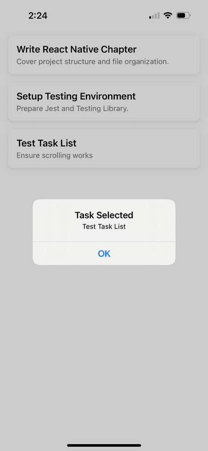
const handlePress = () => {
Alert.alert('Task Selected', `${title}`);
};
return (
<TouchableOpacity onPress={handlePress}>
<View style={styles.card}>
<Text style={styles.title}>{title}</Text>
<Text style={styles.description}>{description}</Text>
</View>
</TouchableOpacity>
);
}
const styles = StyleSheet.create({
card: {
backgroundColor: '#ffffff',
padding: 15,
marginVertical: 8,
marginHorizontal: 16,
borderRadius: 8,
shadowColor: '#000',
shadowOffset: { width: 0, height: 2 },
shadowOpacity: 0.1,
shadowRadius: 4,
elevation: 3,
},
title: {
fontSize: 18,
fontWeight: '600',
},
description: {
fontSize: 14,
color: '#666',
marginTop: 4,
},
});What happens now? When you tap a task card, it shows an alert with the task title.
Alternatives to TouchableOpacity
| Component | Best For | Notes |
|---|---|---|
TouchableHighlight |
Buttons that highlight (usually with a background color) | Good for iOS |
Pressable |
More advanced, supports onPressIn, onPressOut, etc. |
Preferred in newer apps |
TouchableWithoutFeedback |
Custom gestures or dismissing keyboard | Doesn’t provide feedback |
Button |
Basic button with native styling | Not very customizable |
3.6 Pressable: More Control Over Touch Feedback
Pressable is a core component that lets you detect a variety of press interactions (not just a simple tap). It’s highly customizable and can handle states like:
pressedhovered(on web)focusedlong pressdisabled
It allows you to change styles dynamically based on these interaction states.
How is Pressable different from TouchableOpacity and TouchableHighlight?
| Feature | TouchableOpacity |
TouchableHighlight |
Pressable |
|---|---|---|---|
| Touch feedback | Reduces opacity | Adds background highlight | Fully customizable |
| State access | No | No | Yes (pressed, etc.) |
| Style control | Limited | Limited | Dynamic styles via function |
| Event support | onPress |
onPress, onLongPress |
onPress, onPressIn, onPressOut, onLongPress, etc. |
| Preferred for | Simple custom buttons | Highlight-on-touch UIs | Modern, dynamic touch UIs |
Supported Event Props
| Prop | Trigger |
|---|---|
onPress |
When the press is released |
onPressIn |
When the press starts |
onPressOut |
When the press ends |
onLongPress |
After a delay (default: 500ms) |
disabled |
Disables interaction |
Example: Making TaskCard Clickable using Pressable
Modify TaskCard.jsx:
import React from 'react';
import { View, Text, StyleSheet, Pressable, Alert } from 'react-native';


/**
 * A card component to display individual task details.
 * @param props
 * @param props.title The title of the task.
 * @param props.description A brief description of the task.
 * @returns JSX.Element
 */
export default function TaskCard({ title, description }) {
  const handlePress = () => {
    Alert.alert('Task Selected', `${title}`);
  };

  return (
    <Pressable
      onPress={handlePress}
      style={({ pressed }) => [
        styles.card,
        pressed && styles.cardPressed,
      ]}
    >
      <View>
        <Text style={styles.title}>{title}</Text>
        <Text style={styles.description}>{description}</Text>
      </View>
    </Pressable>
  );
}

const styles = StyleSheet.create({
  card: {
    backgroundColor: '#ffffff',
    padding: 15,
    marginVertical: 8,
    marginHorizontal: 16,
    borderRadius: 8,
    shadowColor: '#000',
    shadowOffset: { width: 0, height: 2 },
    shadowOpacity: 0.1,
    shadowRadius: 4,
    elevation: 3,
  },
  cardPressed: {
    opacity: 0.7,
  },
  title: {
    fontSize: 18,
    fontWeight: '600',
  },
  description: {
    fontSize: 14,
    color: '#666',
    marginTop: 4,
  },
});
Why Use Pressable Over Touchable Components?
- Greater control over interaction states
- Cleaner way to change styles dynamically
- Supports more interaction types (especially useful for animations, accessibility)
- More future-proof (React Native team recommends it for new apps)
3.7 Styling Recap for UI Components
In React Native:
- Styles are objects, not CSS strings
- No media queries, but you can use
DimensionsAPI for responsive layouts - Flexbox is the default layout model
We’ll go deeper on styling and theming in the next chapter.
3.8 Assignment
✅ Task:
- Create a new screen called CompletedTasksScreen.js
- Reuse
TaskCardto display a list of completed tasks - Use TouchableOpacity or Pressable to handle item clicks
💡 Hint:
- Use React hooks to manage states to navigate to the correct screen.
- Pass the
handlePress()as a prop to theTaskCardcomponent. - Add custom "
Button" components that allow the user to view incomplete tasks and completed tasks in their respective screens.
In a later chapter we will discuss Navigation and Routing further.
Chapter Summary
You’ve learned:
- The main React Native UI building blocks: View, Text, ScrollView, FlatList, and Touchable components
- How to build a dynamic, scrollable task list
- How to handle user interactions with touchable elements
What is Next?
In Chapter 4, we’ll dive deep into Styling in React Native.
We’ll cover:
- Flexbox layouts
- Dynamic styling
- Themes
- Responsive design
- Styling consistency for scaling
You’ll also learn how to style the entire Task Tracker Mobile app with a unified theme.